The post High Converting Homepage Guide: 7 top tips for more leads appeared first on Rivmedia Web Design.
]]>Create a high converting homepage that works
Did you know you only have around 0-8 seconds to engage site visitors before they bounce?
No pressure right?! Your homepage has the power to attract or deter your site visitors and it all depends on your strategy.
You can breathe easy though as I have provided the following guide based on my years of building strategy-driven websites. It has simple-to-follow steps that you can start implementing today.
At the end of this article, you will also find a handy checklist that covers the most important elements that we’ll explore below.
Here are the 7 top tips that we will cover:
- Header – Where your logo and navigation (main menu) live
- Hero Area
- The problem & your solution
- Social Proof
- Introduce Yourself
- Main CTA (Call To Action)
- Don’t forget Your Footer
1. Header – Where your logo and navigation (main menu) lives
This is where users will start their journey so it’s vital that it is attractive and works. Check off each of the following to optimise your website header:
Your Logo
- Make sure your logo links to your home page. Most sites do it, so users will expect it.
- Ensure your logo is not too big or too small… it has to be just right. Too big and it can be a distraction. Conversely, if it’s too small, people may have to squint when looking at it. Ensure your logo and all text within it are easily readable.
 If you have a logo that is vertically large, consider having an “inline version” of it created. For example, the CCA logo shown here is the original design which is quite “square” in its layout.
So, a horizontal “inline” version was created specifically for usage in narrow areas like the website header.
Main Menu
- Keep menu options to a maximum of 7 with a font size that is easy on the eyes
- Only use sub-menus if absolutely necessary (too much choice can be overwhelming)
- Don’t have your social media links in your header. This used to be common practice but has since shown that it encourages people to leave your site which is counterproductive!
You want them to stay on your site as long as possible (to improve your bounce rate). They can always visit your social pages after they have consumed your more important website content.
- Avoid using clever titles for pages, for example, “journal, or content” instead of familiar names like “blog or resources”.
- The link to your contact page should always be the last link in your main menu and called “contact or contact us”.
- If you have a sticky header (one that remains at the top of the screen when the user scrolls down) make sure it only takes up as much space as necessary. Large headers that take up too much screen space are annoying and can distract from more important content.
- Keep things familiar: There is a reason most successful websites share some universal traits (known as web design standards), such as putting the contact link last. It’s just what we’re used to.
So, when a site visitor is ready to take action, you want to make it as easy as possible for them to do so. It’s ok to be creative in other areas, but when it comes to helping people navigate your site, don’t make them think any longer than they have to!
2. Hero Area
The top of the page (hero area) is the first thing people see when they land on your site. It needs to instantly engage users so they stay, and consume more content. If what you offer and why they should care isn’t obvious, they will leave. It’s that simple.
Here’s a simple formula you can use to get started:
We {do what} {for whom} {with this benefit}
Pro Tips:
? To make sure that your headline is clear, ask yourself if you would use the same words to explain your business to a stranger in 1-2 sentences. Will they understand it right away?
? It’s better to be clear than clever – Your goal here is to communicate effectively and stop people from bouncing off your website. There’s no need to overcomplicate things with puns or witty jokes.
Just use straightforward language that sets clear expectations for the rest of your site.
? The image (or video) that you use in this area is also very important. I strongly recommend using an image of yourself or your team. You ARE your business, so putting yourself out there goes a long way in the process of building trust and likability.
It’s also a great opportunity to show off your personality which will help attract your ideal customers. If you can, get a pro to take the photos for you, the difference in quality will be worth it.
1. The problem and your solution
This is where you start talking about the services you offer. Now that you’ve got their attention with your engaging hero area, this section is all about drawing them in further, displaying empathy and showing how you can help your audience.
It’s important to show your site visitors that you really understand their problems. That you know what they want to move away from because it creates frustration & pain for them. Then, highlight how you solve these problems and what they will gain as a result of working with you.
Pro Tip: Try not to include too many services here. Focus on your signature service, or at most, 3 to 4 of your primary services.
4. Social Proof
Without social proof, your site will lack the evidence required to trigger the psychology needed for your clients to feel comfortable buying. In short, having social proof is a key ingredient for a high converting homepage.
Social proof can be achieved in a number of ways. Here are the most common:
Testimonials / Reviews
Seeing how other people have benefited from your services is a great way to support the promises & claims you have made. Here’s how to optimise your testimonials:
? For customers to see them as genuine, they should be embedded from a reliable source (Google Reviews, Facebook Reviews, etc.)
? If you only have written reviews; include the author’s name, a picture if possible, their role and ideally a website link
? If you don’t have any yet, I strongly advise that you start collecting them now. Here’s a handy guide that includes email templates to help get you started
Key Point: “Research shows that 91 percent of people regularly or occasionally read online reviews, and 84 percent trust online reviews as much as a personal recommendation.” – INC.com
Client & partner logos or press mentions
- A list of clients/brands you’ve worked with and their logos
- Endorsements from celebrities, influencers or people of authority within your niche
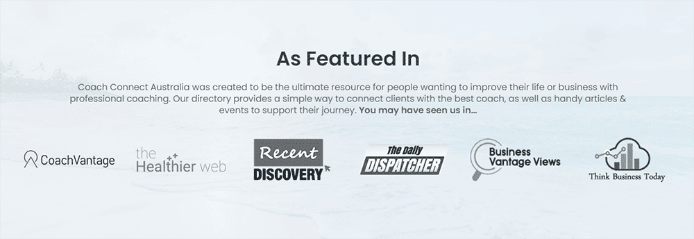
- “As Featured In” or “As Seen In” articles or features
Pro Tips:
? When using logos from other media sources, for obvious reasons it is ideal if you can use recognisable brands.
? If you don’t have many recognisable brands yet, they are still worth including. Even if the visitor isn’t familiar with all of the brands, it still offers visual evidence of legitimacy to help build your credibility and authority.
? When adding logos, be sure to link to the original source. Not only does this add credibility to the source, but having outbound links on your website is also good for SEO.
? If you’re building an “As Featured In” or “As Seen In” section on your site, feel free to include our logo! You can enhance this section on your website and we get a backlink. Win-Win. ?
Achievements & Certifications
Have you managed to reach any milestones or achievements? If so, show them off! Showcasing any achievements you’ve had is another effective way to set your business apart. You could include:
- Any certifications or qualifications you have (this doesn’t always have an obvious impact, but prospects see it as an indication of how knowledgeable you are in your industry)
- Courses you have completed
- Professional Memberships
- Business nominations or awards
Statistics & Numbers
These are another great option and there is a heap of different ways you can do it depending on your niche. Here are some ideas:
- Years in business – obviously if you’ve been around a while you must know what you’re doing!
- Number of happy customers – similar to the above if you’ve worked with a substantial number of people that also demonstrates your authority
- Case studies – These allow you to provide quantifiable evidence that your product or service works
- How many hours or $$ you’ve saved your clients
- ROI: What numbers have your clients achieved that you can show off? % increase in profits, dollars earned, etc.
Pro Tip: The logistic, detail-oriented client, in particular, will absolutely love this kind of information! If they are your ideal customer, adding this data is definitely worth your time.
Final tips for building social proof:
? If possible, add your social proof near the claim it supports
? People connect with people so use imagery as much as you can. If your clients are ok with it, include their picture with their testimonial or case study
? When using logos, try to ensure the resolution and quality is good. I also recommend making them black & white so as not to distract from your branding too much
? If you don’t have a lot of logos to include just yet, that’s ok! Even 3-4 is better than none. You can always come back and update it later!
5. Introduce Yourself
This is your opportunity to tell your audience who you are, and what qualifies you to help them.
Pro Tips:
? Even though this is an “about” section, it’s actually not about you! So don’t just list your history and credentials or why you’re so great. Talk about how you can serve your customers.
? Keep it brief. Your homepage is a “taster” for the rest of the site. You can go into more detail within your dedicated about page.
? Include a photo of yourself or your team. Remember, you ARE your business, so showing yourself goes a long way in the process of building trust and likability.
6. Main CTA (Call To Action)
People are extremely unlikely to buy from you after the first visit to your homepage. More time is needed to nurture your leads through the sales journey. Your homepage is one of many steps in this process.
So, at this early stage, what else can you offer them to build on the relationship? What action would you like them to take next?
Most commonly, your main CTA will be for people to opt-in to your lead magnet and for good reason. Lead magnets are not just about building a subscriber list. Yes, that’s one of the primary purposes (because it allows you to market your offerings further), but they have so much more to offer:
? They allow customers to experience how you can help them without any risk because what you’re offering is completely free.
? If you give them a quick win, this will start your relationship on a positive note. Plus, it will also help make them more interested in your paid offers… If your free offer is great, imagine what they can get from your paid ones!
? You start to build relationships: people aren’t usually ready to buy from you straight away. A lead magnet is a means of beginning the process of nurturing prospects through the sales journey so by the time they speak to you, they’re a red hot lead.
? You can showcase your expertise by being able to provide a valuable resource. This will help establish you as an expert and position your business as the go-to resource.
? They qualify leads: If your offer is specific enough to a particular audience it can help you to focus on building relationships specifically with your ideal customers.
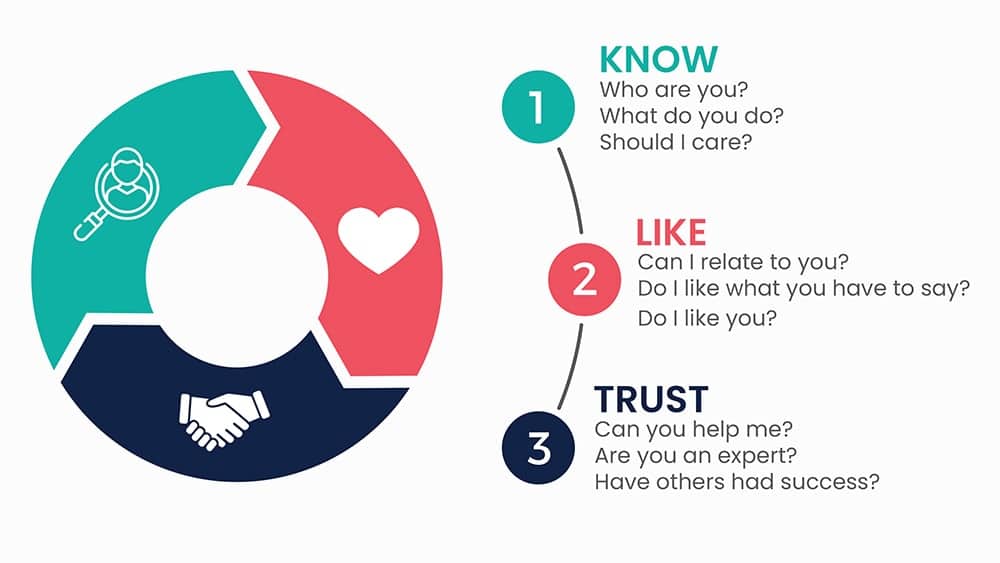
? It’s one method of building Know, Like & Trust which represents the journey a person takes when getting to know your business. They first have to know you. Then they can start to like you and finally begin to trust you. All essential elements in converting leads into customers.
If you don’t have a lead magnet, here are a few other suggestions for your homepage CTA:
- Showcase your most popular blog posts
- Encourage them to visit a specific page (i.e. services or work with me)
- Ask them to sign up for your newsletter (include a compelling reason why)
- Link to your social media pages or groups to continue the conversation there
7. Don’t forget Your Footer
Being at the very bottom of the page, the poor footer section is often overlooked. The thing is though if people are given a reason to scroll, they will! So your footer deserves just as much attention as the elements above it.
I should note, that some elements (such as your copyright notice) should also be included in your footer. As this article’s focus is conversions though, I’ve stuck to those elements:
Links to social media
Your social media pages are another great avenue for building know, like and trust, as well as credibility and authority. As discussed above you don’t want them anywhere near the top of your page.
The point is to keep people on your website as long as possible. So the footer is a much better location.
Pro Tip: Set your social links to open in a new window rather than the same one, so they still have your website open in a tab and can come back to it easily.
Newsletter Opt-in
Either in or just above your footer is a great place to have your Newsletter opt-in.
Pro Tip: Back in the day when getting emails was exciting and our inboxes weren’t filled with spam, capturing leads was easy. Today though, people are less willing to part with their details. They have to feel confident that there’s something of great value in it for them.
So, instead of just having a newsletter opt-in to “stay up to date with your latest news” – try to offer more incentives. Exclusive information, upcoming promotions, or a prime example would be in exchange for your lead magnet.
One final CTA
Every page on your website should have a CTA and I trust you have already covered your main CTA for the homepage, but you can pop another one in your footer too. This is particularly handy as it is accessible on every page of your site.
For example, you can remind them of and link to your main CTA. Or, link to your contact page or booking form.
Final Tips for Creating a High Converting Homepage
Know your audience:
Your website is a tool that represents your business online and connects you with your audience. So who are you hoping to reach? Who are your ideal customers?
If you don’t have complete clarity on who your ideal customers are, you’ll never know what they really need, let alone how to write compelling content that resonates and inspires them to buy.
So, before writing any copy for your homepage, I strongly encourage you to get crystal clear on your ideal customers. It literally forms the foundation of ALL your marketing efforts (website copy, content marketing, lead magnets, social media advertising, you name it!).
So, if it’s not on point, you’re really limiting your potential for everything else that follows it. I’ve already written an article about this which will help get you started. Check it out here ? Successful marketing: It starts with your ideal customer
Keep the content brief:
The homepage is an overview of your business – the primary purpose generally being to draw people in, not overwhelm them with too much information. It should be a “taste” of each of the other internal pages and act as the proxy for checking out the rest of the website.
Tech stuff:
We’re dealing with websites so some tech stuff is unavoidable. Essentially, you need to make sure your website’s usability is good. There’s nothing more frustrating than a website that has broken elements, is difficult to navigate, or is snail-paced slow.
People have very little patience with this. So, be sure to cover these elements as best you can:
- Mobile Responsiveness – this is a MUST
- Site speed
- Easy navigation
- Interactive elements all working (i.e. contact or booking forms)
- No broken links
- Simplicity: focus on what’s important, don’t distract people with unnecessary bells & whistles. For example, revolving slideshows or carousels used to be super-slick but no more! Plus, they can hide really valuable content.
Purpose-driven copy:
Combined with nailing the other features of your site (design, SEO etc.), having compelling website copy will give you the best shot at achieving your ultimate goal – converting visitors into customers.
If you can invest in a copywriter to help, great! If not, you don’t have to be a professional writer to create compelling content. You just have to follow some simple guidelines. Here are some quick tips:
? Get clear on your objectives upfront. Determining what outcomes you want before writing a single word, will help guide the content you create. As Stephen Covey, author of The 7 Habits of Highly Effective People said; “Begin with the end in mind.”
? Know Your Audience: As discussed above, if you have clarity on who your ideal customers are, it will be easier to write compelling content that resonates and inspires them to take action.
? Use powerful headlines: Most people scan written content, so your headlines need to be attention-grabbing and on point.
? Write in a way that is clear, concise and ideally reaches people on an emotional level.
? Avoid jargon and lengthy sentences. Break up text with images, headings, lists and graphics. Keep the language simple and easy to digest – If a 5th grader can read it, great!
? Don’t just talk about the features of your service, focus on the benefits and outcomes – that’s what people buy.

Images:
The images you use on your homepage (and the entire website) can greatly impact the perception you give to your site visitors. If they are pixelated and of low quality, that can have a negative influence. If your site looks low quality, that can translate to the quality of your service too. ?
On the flip side, if you use high-quality images that showcase your personality, that can leave a positive impact. ?
Finally, using stock images (quality ones) is sometimes unavoidable but whenever you can use your own images. They are far more personal.
Include videos if you can:
Current trends have shown a consistent increase in video consumption over the last few years and the value they provide can be tremendous. It’s a great way to deliver lots of information quickly, your site visitors can get to know you easier, and it’s a great way to stand out from your competition.
Be realistic:
If you can’t check everything off in this guide, thank’s ok! For example, perhaps you’re just starting out and only have 1 or 2 reviews, or maybe none at all. Don’t stress. We all have to start somewhere, but at least you can make a start!
Also, get your head around the concept that your homepage and site as a whole will NEVER be done. Websites are not meant to be static, they need to be constantly evolving. Factor in some regular time in your schedule to work on it.
Be yourself:
I’ve already said above that you ARE your business so don’t be shy, let your personality shine! Allow your audience to get to know you. It’s the best way to discover if you’re a good fit for them from the get-go, and if you’re not, that’s ok! You only want to attract your ideal customers.
If you’re a nerd like me, geek out! If you’re full of energy, be bubbly. If you’re serious and systematic, be so… Whatever you do, just be yourself.
High Converting Homepage Checklist
I know this was a long read so if you made it this far, you’re awesome!
Now, as promised, here’s a handy checklist that covers most of the elements discussed above. Check all of these and your homepage will be in great shape!
? Pretend you’re a client – have a quick glance at your homepage. Do you immediately know who you are, what you offer and why it matters?
? Is your copy easy to understand, jargon-free and clear? Can a 5th grader understand it?
? Have you demonstrated social proof and why people should trust you?
? Are there strong CTAs (calls to action) telling your site visitors what to do next? And are those next steps easy to find/use?
? Do you offer something juicy that encourages people to sign up for your newsletter or get in touch with you?
? Have you included pictures of yourself or your team and given visitors a taste of your personality?
? How does your website look on your phone?
? Is it easy to navigate, loads quickly and everything works properly?
And that’s a wrap!
Again congrats on getting this far. I know there’s a lot of information, but don’t be overwhelmed. Just chip away one task at a time. Like anything worth doing, the effort will be worth it!
And remember…
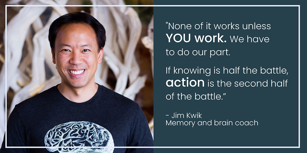
I hope you’ve gained plenty of takeaways that you can start implementing straight away and see your conversions skyrocket!
And if you would like help with creating a client-converting website, I would love to hear from you. Take a look at what I do here: Coaching websites that work.
All the best,
Libby ?
Coaching Website Specialist
Rivmedia Web Design
The post High Converting Homepage Guide: 7 top tips for more leads appeared first on Rivmedia Web Design.
]]>